
diff options
Diffstat (limited to 'docs/guides/monitor/kubernetes-k8s-netdata.md')
| -rw-r--r-- | docs/guides/monitor/kubernetes-k8s-netdata.md | 4 |
1 files changed, 2 insertions, 2 deletions
diff --git a/docs/guides/monitor/kubernetes-k8s-netdata.md b/docs/guides/monitor/kubernetes-k8s-netdata.md index 19fe740729..d09ec6ed55 100644 --- a/docs/guides/monitor/kubernetes-k8s-netdata.md +++ b/docs/guides/monitor/kubernetes-k8s-netdata.md @@ -123,7 +123,7 @@ visualizations](https://user-images.githubusercontent.com/1153921/109049195-349f ### Health map -The first visualization is the [health map](https://github.com/netdata/netdata/blob/master/docs/cloud/visualize/kubernetes.md#health-map), +The first visualization is the [health map](https://github.com/netdata/netdata/blob/master/docs/dashboard/kubernetes-tab.md#health-map), which places each container into its own box, then varies the intensity of their color to visualize the resource utilization. By default, the health map shows the **average CPU utilization as a percentage of the configured limit** for every container in your cluster. @@ -156,7 +156,7 @@ different namespaces. 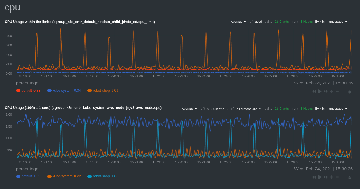 -Each composite chart has a [definition bar](https://github.com/netdata/netdata/blob/master/docs/cloud/visualize/interact-new-charts.md#definition-bar) +Each composite chart has a [definition bar](https://github.com/netdata/netdata/blob/master/docs/dashboard/netdata-charts.md#definition-bar) for complete customization. For example, grouping the top chart by `k8s_container_name` reveals new information. 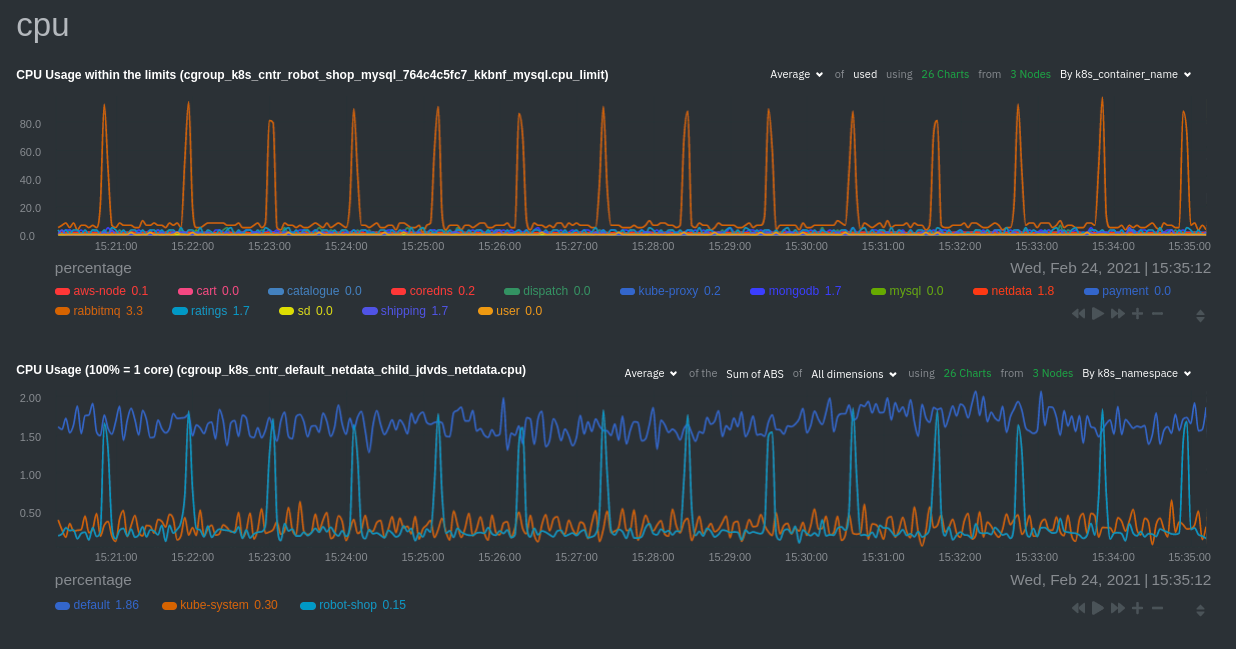 |