
diff options
Diffstat (limited to 'docs/guides')
| -rw-r--r-- | docs/guides/monitor/anomaly-detection.md | 2 | ||||
| -rw-r--r-- | docs/guides/monitor/kubernetes-k8s-netdata.md | 8 | ||||
| -rw-r--r-- | docs/guides/troubleshoot/monitor-debug-applications-ebpf.md | 2 |
3 files changed, 3 insertions, 9 deletions
diff --git a/docs/guides/monitor/anomaly-detection.md b/docs/guides/monitor/anomaly-detection.md index bc19a4f28c..edd88896a6 100644 --- a/docs/guides/monitor/anomaly-detection.md +++ b/docs/guides/monitor/anomaly-detection.md @@ -45,7 +45,7 @@ Once an area on the Anomaly Rate chart is highlighted netdata will append a "hea ## Embedded Anomaly Rate Charts -Charts in both the [Overview](https://github.com/netdata/netdata/blob/master/docs/cloud/visualize/overview.md) and [single node dashboard](https://github.com/netdata/netdata/blob/master/docs/cloud/visualize/overview.md#jump-to-single-node-dashboards) tabs also expose the underlying anomaly rates for each dimension so users can easily see if the raw metrics are considered anomalous or not by Netdata. +Charts in both the [Metrics tab](https://github.com/netdata/netdata/blob/master/docs/dashboard/metrics-tab-and-single-node-tabs.md) and [single node tabs](https://github.com/netdata/netdata/blob/master/docs/dashboard/metrics-tab-and-single-node-tabs.md) also expose the underlying anomaly rates for each dimension so users can easily see if the raw metrics are considered anomalous or not by Netdata. Pressing the anomalies icon (next to the information icon in the chart header) will expand the anomaly rate chart to make it easy to see how the anomaly rate for any individual dimension corresponds to the raw underlying data. In the example below we can see that the spike in `system.pgpgio|in` corresponded in the anomaly rate for that dimension jumping to 100% for a small period of time until the spike passed. diff --git a/docs/guides/monitor/kubernetes-k8s-netdata.md b/docs/guides/monitor/kubernetes-k8s-netdata.md index feefdc7208..19fe740729 100644 --- a/docs/guides/monitor/kubernetes-k8s-netdata.md +++ b/docs/guides/monitor/kubernetes-k8s-netdata.md @@ -95,12 +95,6 @@ Netdata and connect your cluster's nodes, you're ready to check out the visualiz To get started, [sign in](https://app.netdata.cloud/sign-in?cloudRoute=/spaces) to your Netdata Cloud account. Head over to the War Room you connected your cluster to, if not **General**. -Netdata Cloud is already visualizing your Kubernetes metrics, streamed in real-time from each node, in the -[Overview](https://github.com/netdata/netdata/blob/master/docs/cloud/visualize/overview.md): - -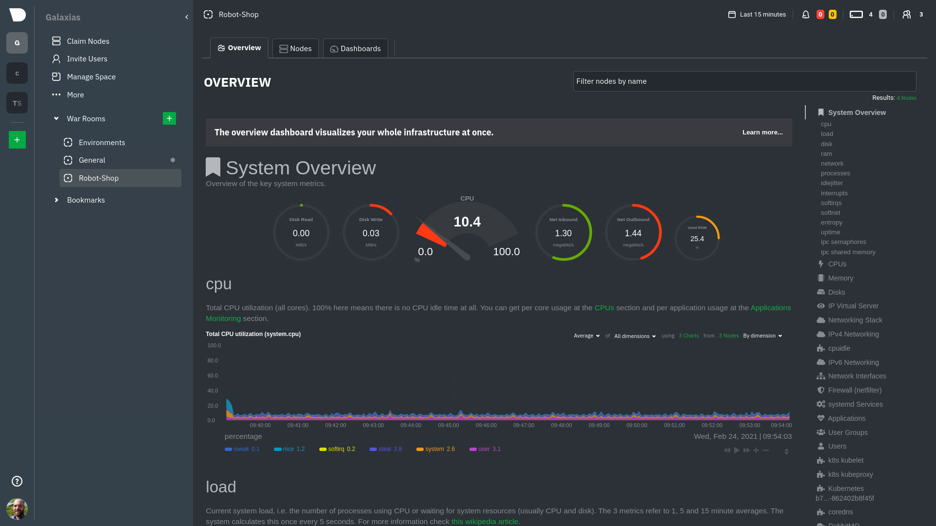 - Let's walk through monitoring each layer of a Kubernetes cluster using the Overview as our framework. ## Cluster and node metrics @@ -162,7 +156,7 @@ different namespaces. 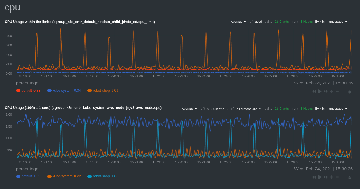 -Each composite chart has a [definition bar](https://github.com/netdata/netdata/blob/master/docs/cloud/visualize/overview.md#definition-bar) +Each composite chart has a [definition bar](https://github.com/netdata/netdata/blob/master/docs/cloud/visualize/interact-new-charts.md#definition-bar) for complete customization. For example, grouping the top chart by `k8s_container_name` reveals new information. 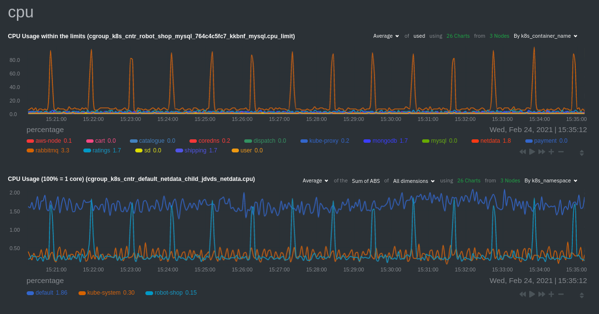 diff --git a/docs/guides/troubleshoot/monitor-debug-applications-ebpf.md b/docs/guides/troubleshoot/monitor-debug-applications-ebpf.md index c75037d8ce..e99cfc9ed5 100644 --- a/docs/guides/troubleshoot/monitor-debug-applications-ebpf.md +++ b/docs/guides/troubleshoot/monitor-debug-applications-ebpf.md @@ -243,7 +243,7 @@ You can also read how to [monitor your infrastructure with Netdata Cloud](https: Once you've added one or more nodes to a Space in Netdata Cloud, you can see aggregated eBPF metrics in the Overview dashboard under the same **Applications** or **eBPF** sections that you -find on the local Agent dashboard. Or, [create new dashboards](https://github.com/netdata/netdata/blob/master/docs/cloud/visualize/dashboards.md) using eBPF metrics +find on the local Agent dashboard. Or, [create new dashboards](https://github.com/netdata/netdata/blob/master/docs/dashboard/dashboards-tab.md) using eBPF metrics from any number of distributed nodes to see how your application interacts with multiple Linux kernels on multiple Linux systems. |