1
2
3
4
5
6
7
8
9
10
11
12
13
14
15
16
17
18
19
20
21
22
23
24
25
26
27
28
29
30
31
32
33
34
35
36
37
38
39
40
41
42
43
44
45
46
47
48
49
50
51
52
53
54
55
56
57
58
59
60
61
62
63
64
65
66
67
68
69
70
71
72
73
74
75
76
77
78
79
80
81
82
83
84
85
86
87
88
89
90
91
92
93
94
95
96
97
98
99
100
101
102
103
104
105
106
107
108
109
|
---
title: Interactive Charts
sidebar_position: 9
description: This page provides a detailed explanation of the OpenBB Interactive Charts. Understand various capabilities including annotation, color modification, drawing tools, data export, and supplementary data overlay.
keywords:
- interactive charts
- PyWry
- annotation
- drawing
- lines
- modebar
- plotly
- data export
- data overlay
- editing chart title
- Toolbar
- Text Tools
- Draw Tools
- Export Tools
---
import HeadTitle from '@site/src/components/General/HeadTitle.tsx';
<HeadTitle title="Interactive Charts - | OpenBB CLI Docs" />
Interactive charts open in a separate window ([PyWry](https://github.com/OpenBB-finance/pywry)). The OpenBB charting library provides interactive and highly customizable charts.
:::tip
Not all commands have a charting output, the ones that do, will display a chart argument (`--chart`), which will trigger the charting output instead of the default table output.
Example: `equity/price/historical --symbol AAPL --chart`
:::
<details>
<summary>Charting cheat sheet </summary>
</details>
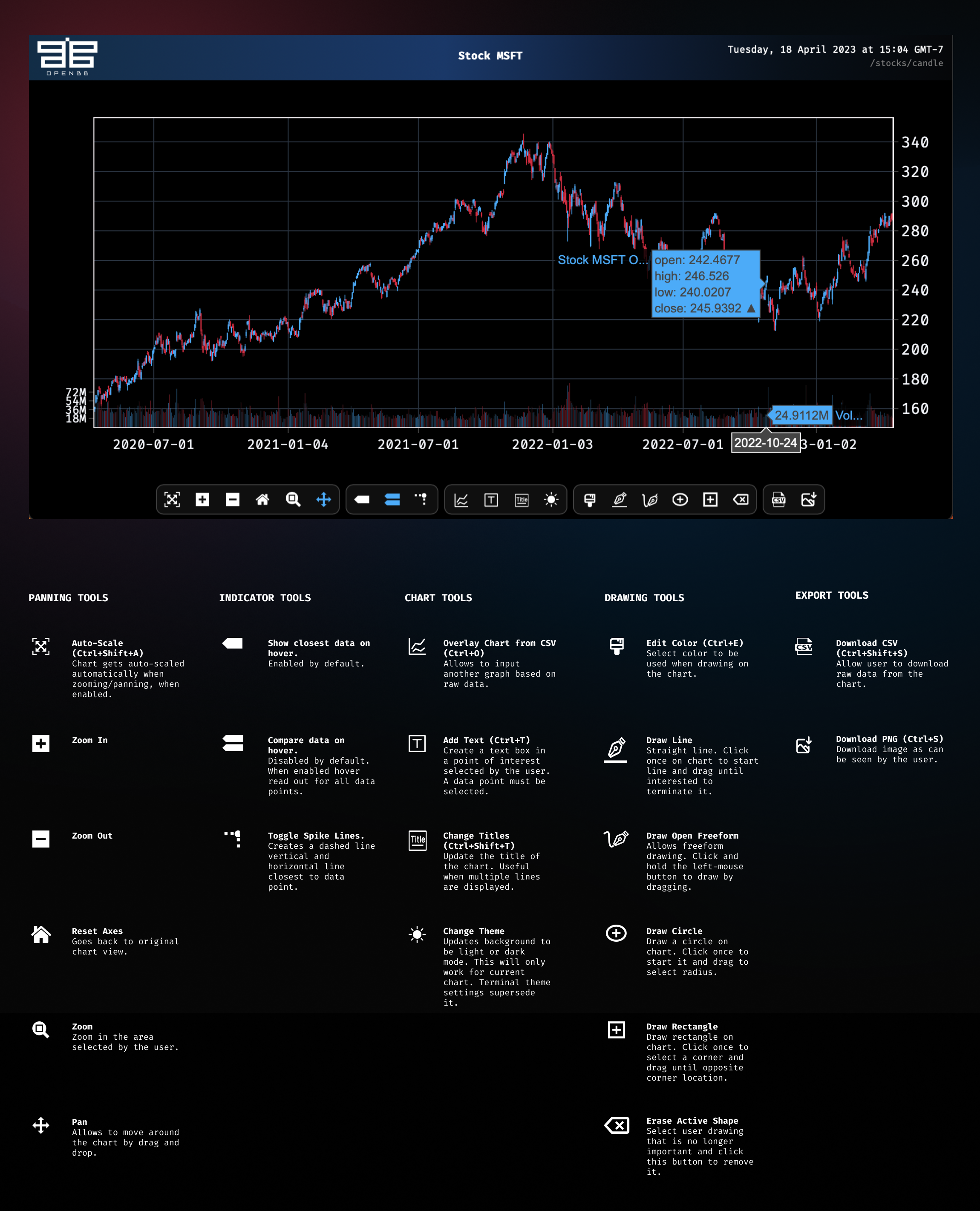
## Toolbar
The toolbar is located at the bottom of the window, and provides methods for:
- Panning and zooming.
- Modifying the title and axis labels.
- Adjusting the hover read out.
- Toggling light/dark mode.
- Annotating and drawing.
- Exporting raw data.
- Saving the chart as an image.
- Adding supplementary external data as an overlay.
The label for each tool is displayed by holding the mouse over it.
The toolbar's visibility can be toggled utilizing the `ctrl + h` shortcut.
## Text Tools
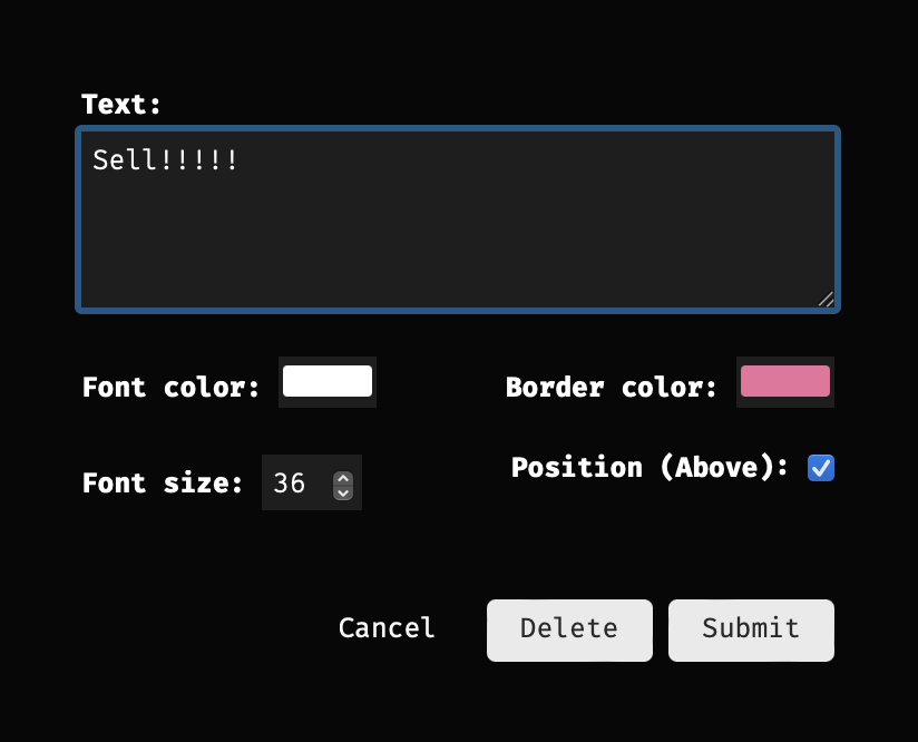
Annotate a chart by clicking on the `Add Text` button, or with the keyboard, `ctrl + t`.
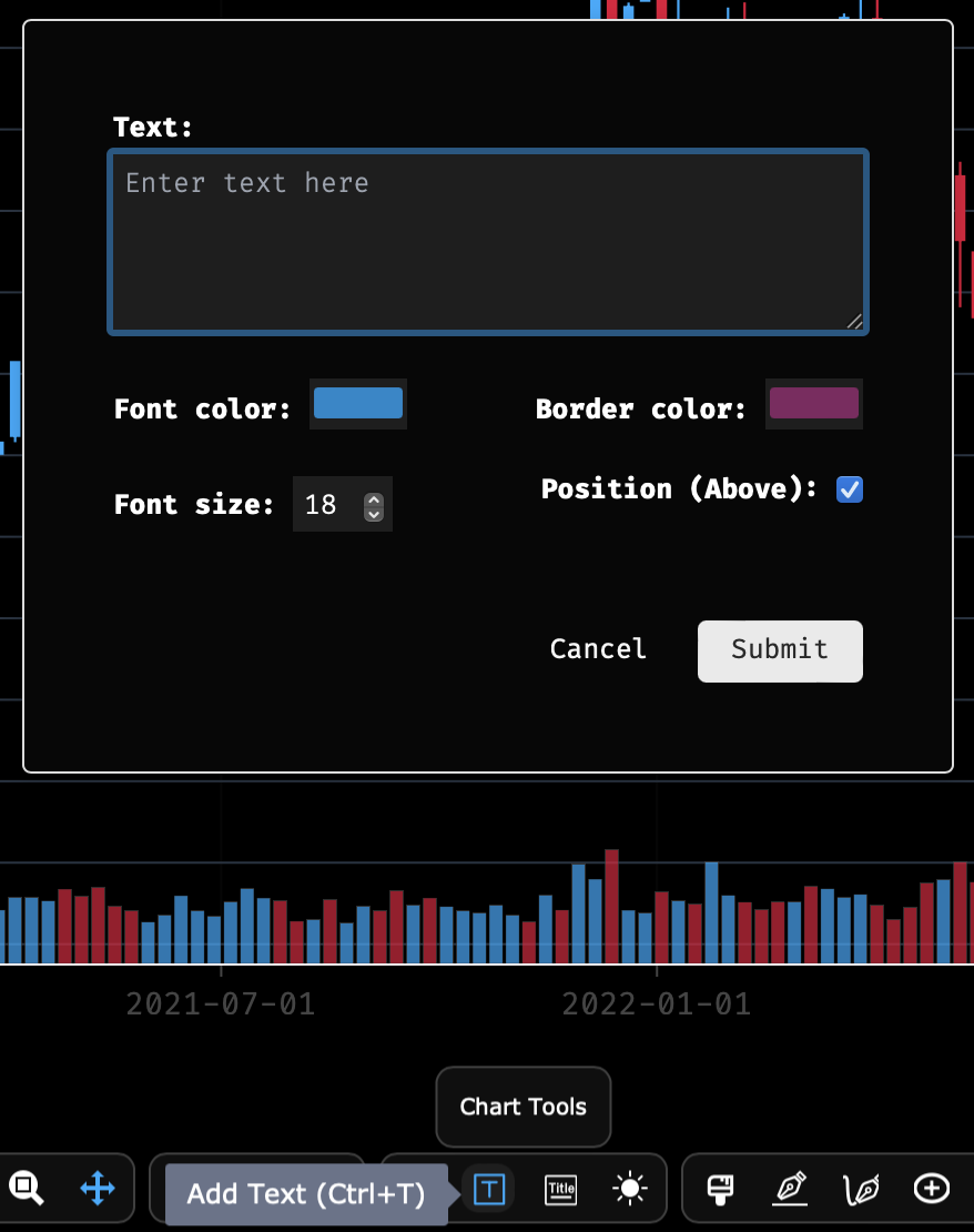
Enter some text, make any adjustments to the options, then `submit`. Place the crosshairs over the desired data point and click to place the text.
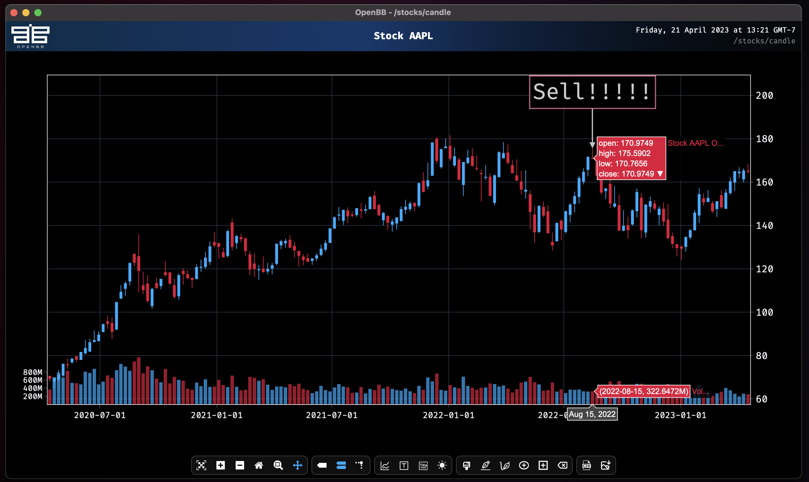
After placement, the text can be updated or deleted by clicking on it again.
## Change Titles
The title of the chart is edited by clicking the button, `Change Titles`, near the middle center of the toolbar, immediately to the right of the `Add Text` button.
## Draw Tools
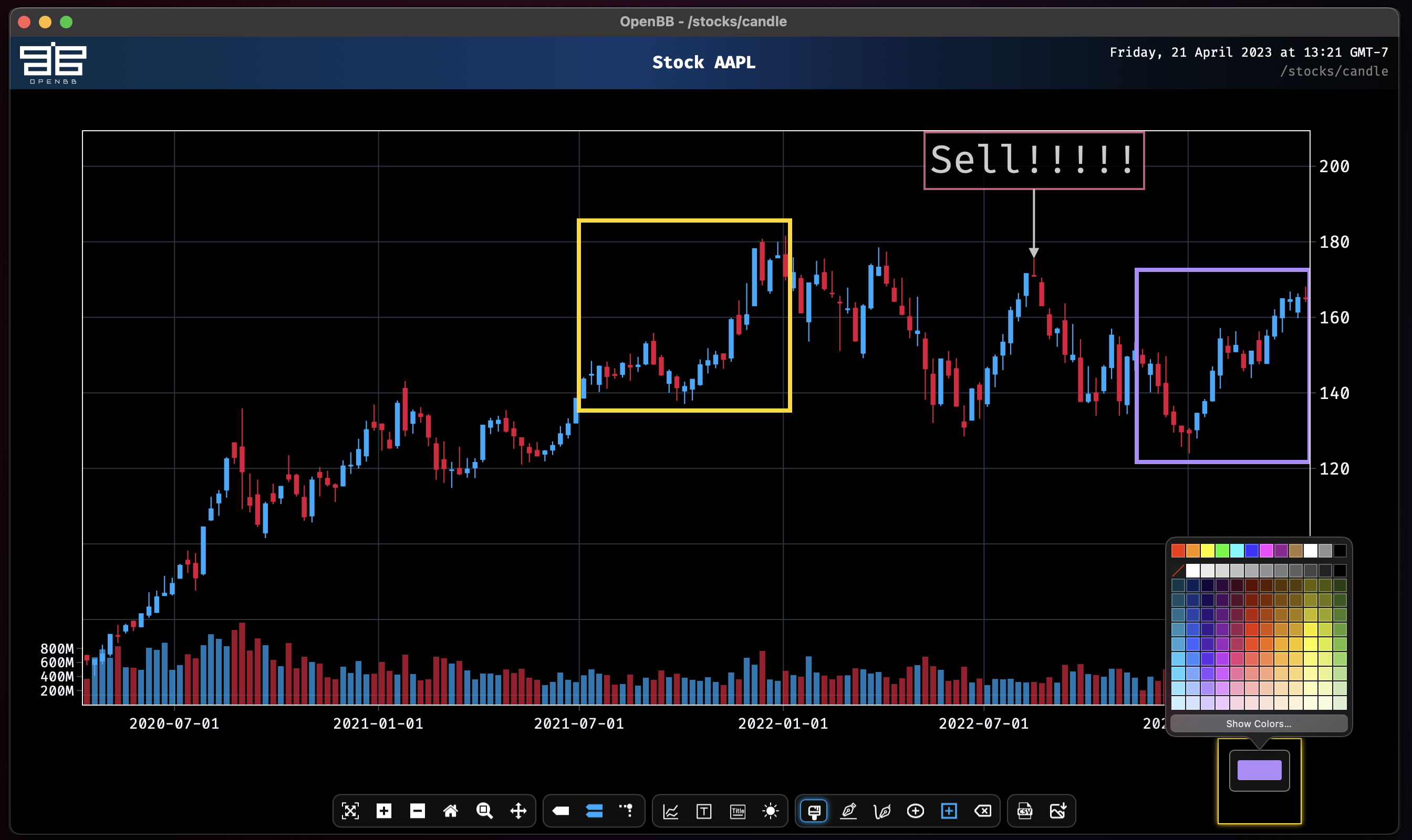
The fourth group of icons on the toolbar are for drawing lines and shapes.
- Edit the colors.
- Draw a straight line.
- Draw a freeform line.
- Draw a circle.
- Draw a rectangle.
- Erase a shape.
To draw on the chart, select one of the four drawing buttons and drag the mouse over the desired area. Click on any existing shape to modify it by dragging with the mouse and editing the color, or remove it by clicking the toolbar button, `Erase Active Shape`. The edit colors button will pop up as a floating icon, and clicking on that will display the color palette.
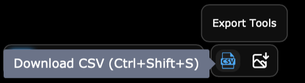
## Export Tools
The two buttons at the far-right of the toolbar are for saving the raw data or, to save an image file of the chart at the current panned and zoomed view.
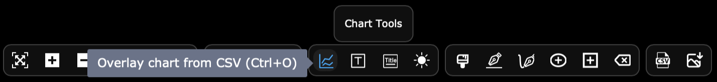
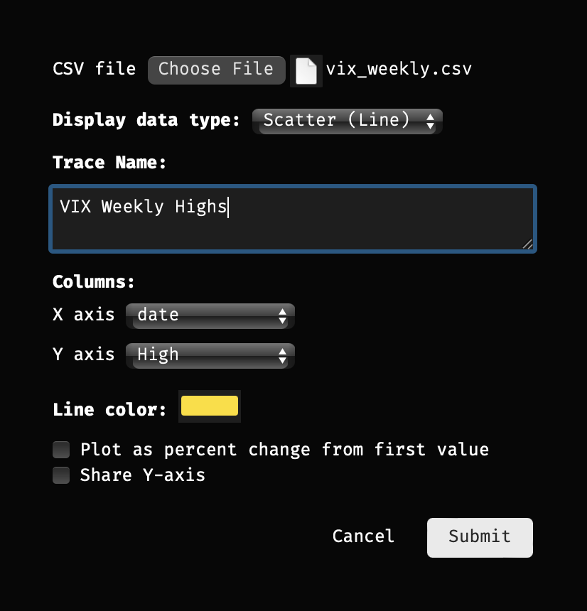
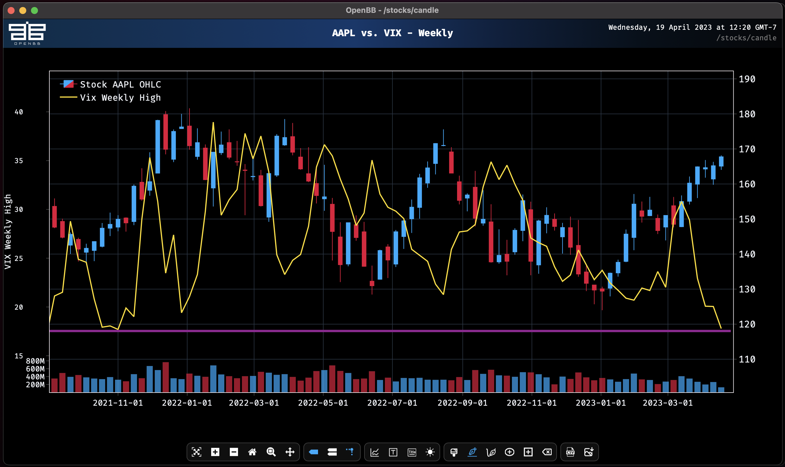
## Overlay
The button, `Overlay chart from CSV`, provides an easy import method for supplementing a chart with additional data. Clicking on the button opens a pop-up dialogue to select the file, column, and whether the overlay should be a bar, candlestick, or line chart. As a candlestick, the CSV file must contain OHLC data. The import window can also be opened with the keyboard, `ctrl-o`.
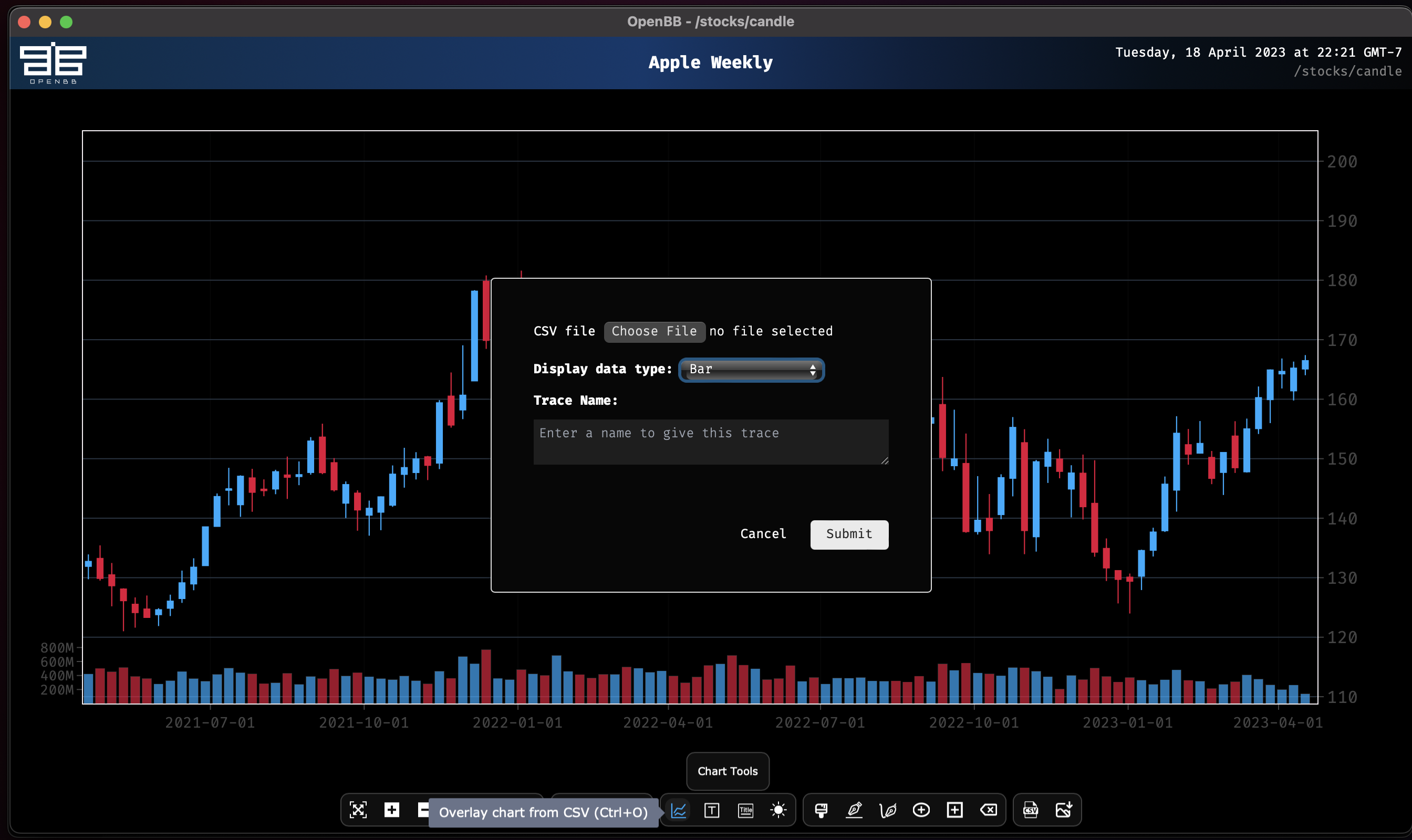
After choosing the file to overlay, select what to show and then click on `Submit`.
|
